04 BARtr
“I really want to get rid of my old item, but I just don’t have the motivation to do it.”
BARTr is a peer-to-peer app designed to help people trade, sell, or donate items they no longer need.
It came out of a real moment; during COVID, more people were working from home and looking to clear out space, but the process of actually getting rid of stuff felt like a chore.
The MVP focused on three things: making it easy to list an item for trade or sale, verifying users and items to build trust, and giving people a simple path to donate what they didn't want to sell.
Role
UX Researcher, UXD
Duration
2 Weeks
Client
BARTr
Team
Cameron Stevens
Software Used


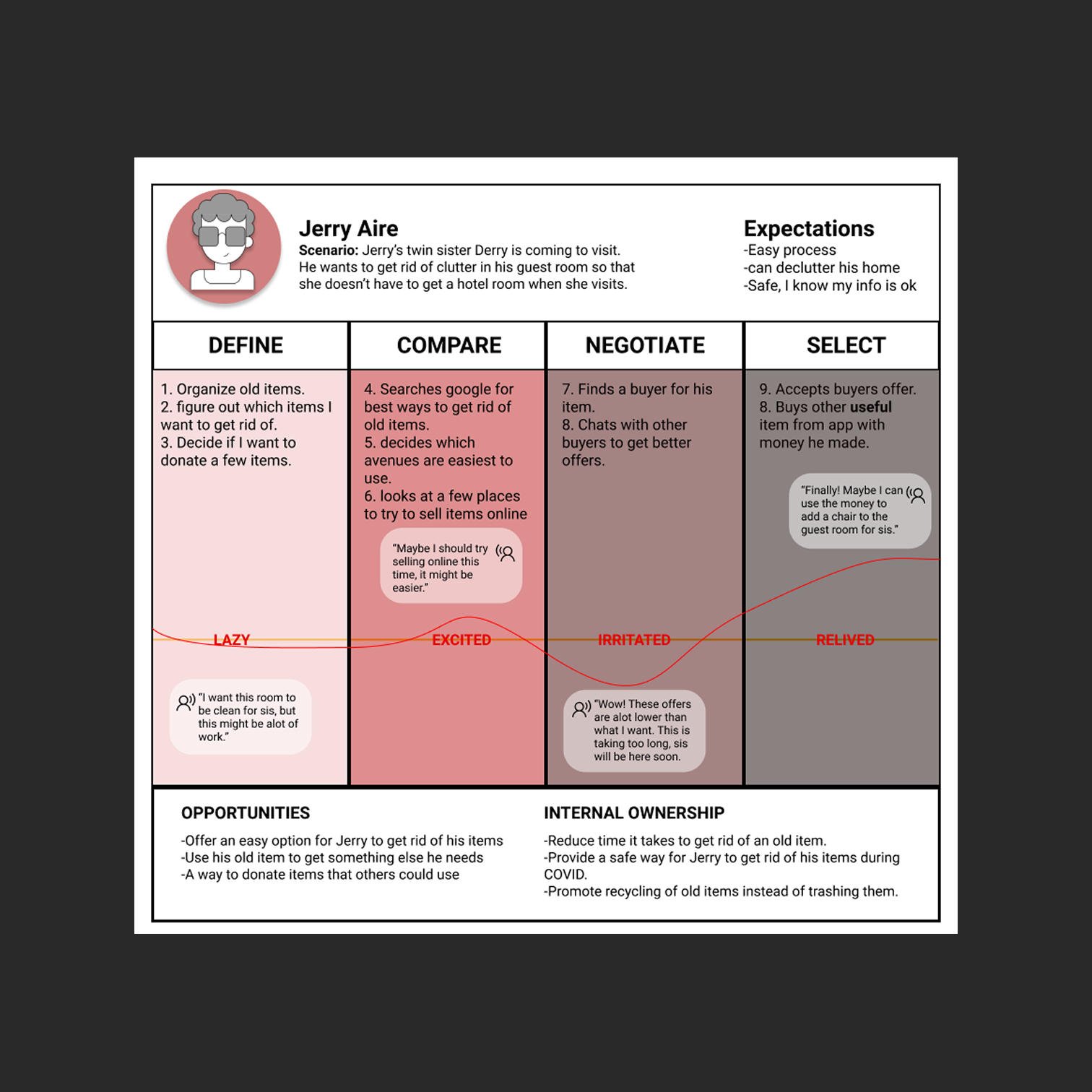
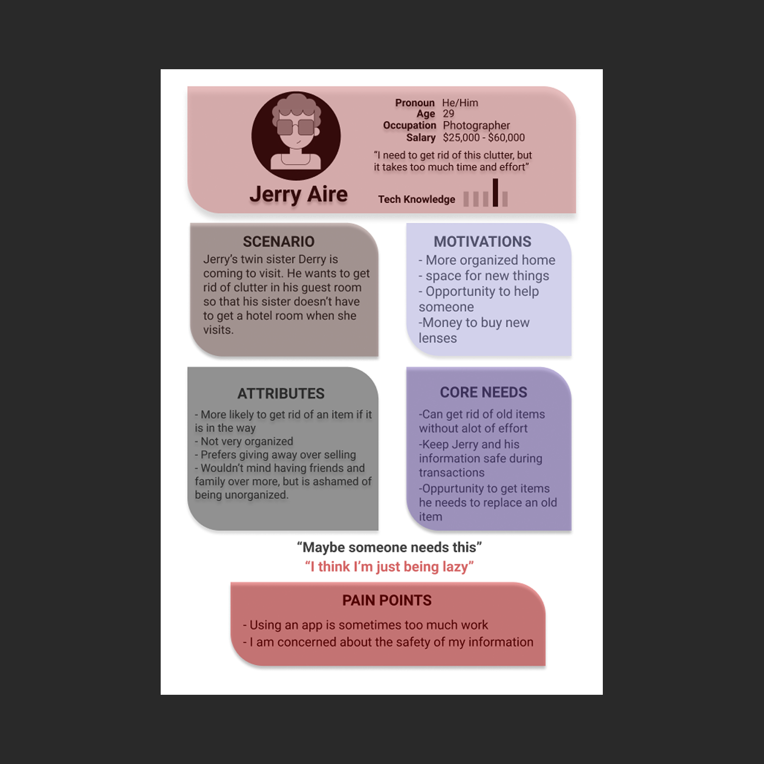
The research started with empathy. If we understand why someone like Jerry gets frustrated when a buyer lowballs him mid-negotiation, we can design around that friction.
If survey data tells us users feel excited about trying a new way to offload their stuff, we can figure out how to sustain that energy throughout the full experience instead of losing them halfway through.
The central question was simple: why do people find it so hard to get rid of old items? Three pain points came up consistently.
The process feels tedious and people lose motivation before they even start. Safety is a real concern; users worry about exposing personal information to strangers.
And for people who want to donate, there's no clear answer for where to actually take their stuff.
User interviews reinforced all of this. People told us they don't like throwing things away, they find selling difficult, and most of the time they just feel too unmotivated to deal with it.
The emotional landscape was a mix of laziness, anxiety, caution, and frustration.
We ran a structured ideation session pairing the research team with a group of testers.
Testers were given the HMW statements and had one to two minutes to write down whatever solutions came to mind.
The value here is seeing how people outside the project imagine solving the problem; it pulls you out of your own assumptions and surfaces ideas you wouldn't reach on your own.
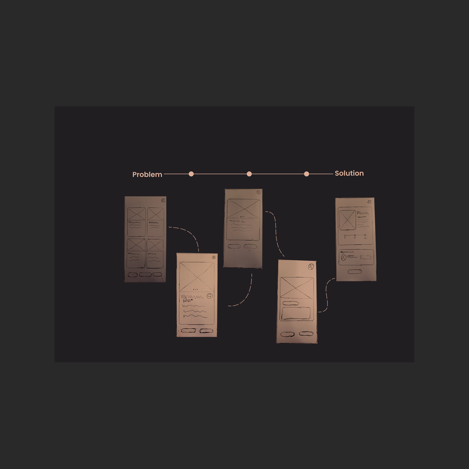
Before touching any design tool, I mapped out task flows to understand how a user would move through the app end to end.
This step eliminates redundant work; if you know the flow before you start building screens, you catch structural problems early instead of fixing them in high-fidelity.
From there, I moved into low-fidelity wireframes and built wire flows to stress-test the design before usability testing.
The design kept evolving through each round of testing. If users were hitting friction, the priority was to isolate and fix it immediately rather than carry issues forward.
I approached the full process with a continuous iteration mindset; treating the design as something that improves with every pass, not something you get right the first time.
Two areas I'd prioritize with more time: a user verification system to reduce spam and build trust between users, and an integrated shipping flow using QR codes with major carriers so users can handle handoffs without leaving the app.
Please Scroll