03 Readtronic
"I like recommendations because I don’t have to spend time thinking about what to read next... the computer knows what I like"
Readtronic is a text-to-audio app built for busy professionals and students who have more to read than time to read it.
It converts articles, blogs, and documents into audio you can listen to while commuting, working out, or handling things around the house.
The app launched in January 2020 but was seeing significant user drop-off after initial download.
Our team was brought in to address onboarding and retention; figure out why people weren't sticking around and design solutions to change that.
Role
UX Research, UID|UXD
Duration
3 Weeks
Client
Kevin Gaffney
Team
Cameron S., Saadia K., Karla R. M., Margaux A.
Software Used


Survey Insights:
We ran surveys, interviews, and usability tests across current and potential users. From 30+ survey responses, a clear pattern emerged: people felt either too busy or too overwhelmed by the volume of content available to them.
Most were getting their information from online articles, podcasts, and social media.
We followed up with five interviews to dig deeper into those behaviors, and ran baseline usability tests with two current Readtronic users.
For the baseline tests, we gave users two tasks; find an article and play it, and find an article and add it to a playlist.
Task one took nearly four minutes to complete, and task two resulted in one user failing entirely. That told us the core experience had serious findability and navigation issues before we even got to retention.
Research Insights:
We ran our interview and survey data through affinity mapping and landed on eight key themes: recommendations and discovery, content length, navigation and search, staying informed, voice quality, ability to multitask, content quality, and following specific writers or creators. These became the lens we used to evaluate every design decision moving forward.
We looked at both direct and indirect competitors and compared feature sets across each app.
The goal was to identify opportunities that fit Readtronic's positioning without turning it into a clone of something else.
A common thread across competitors was the presence of a content library, but most were missing a search feature, a way to organize saved content, personalized recommendations, and a quick-add option for pasting article URLs.
That gap gave Readtronic a clear lane to differentiate.
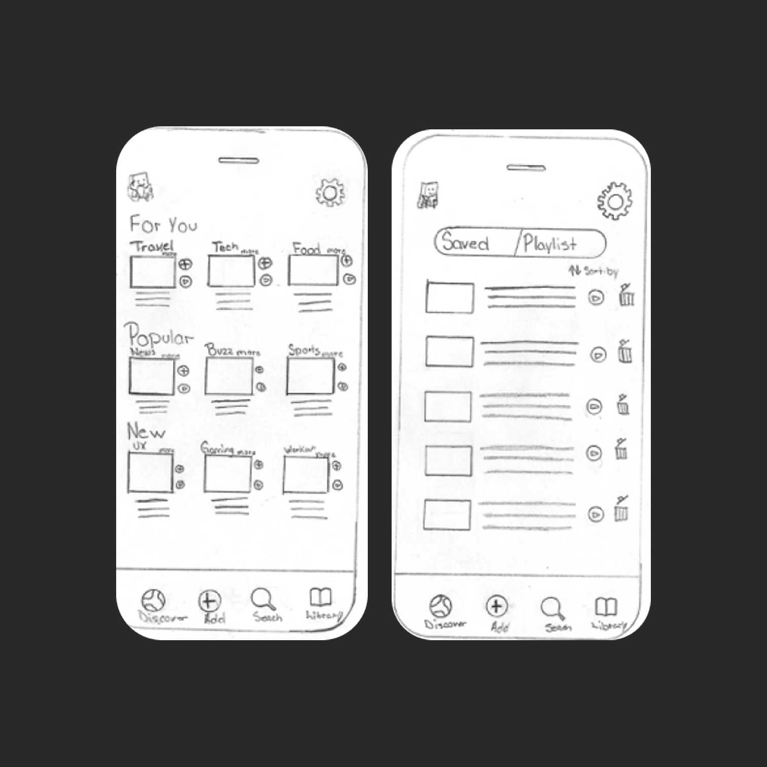
Paper Prototype Testing:
Before jumping into screens, we wanted to validate that we were building the right features.
We ran paper prototype tests with simulated tap interactions, using tasks similar to the baseline: find an article in your library and listen to it, and find an article about NFTs and add it to an existing playlist.
Testers could complete the core actions, but there was clear confusion around icon meaning and bottom navigation labeling.
It took users longer than expected to work through tasks, and one user failed a task; the same pattern we saw in baseline testing.
That told us the information architecture and labeling needed work before we moved forward.
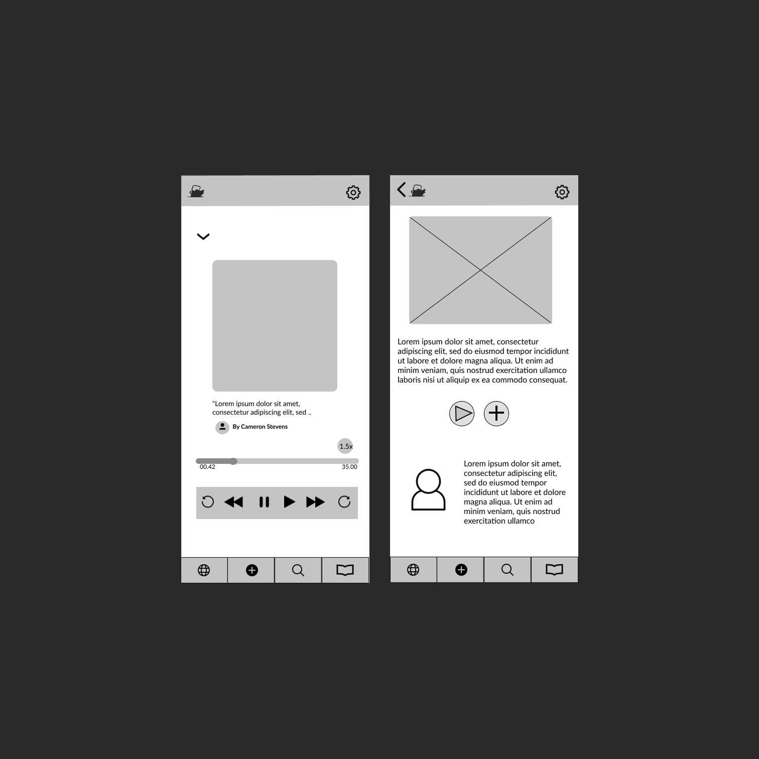
Lo-Fi Insights:
After iterating into a low-fidelity prototype, icon confusion persisted. Labels on the discover page meant different things to different testers.
Section headers weren't clear enough, and multiple testers suggested adding explicit labels to improve scannability.
The author section also drew criticism for taking up too much screen space relative to its value. We carried all of this into the next round.
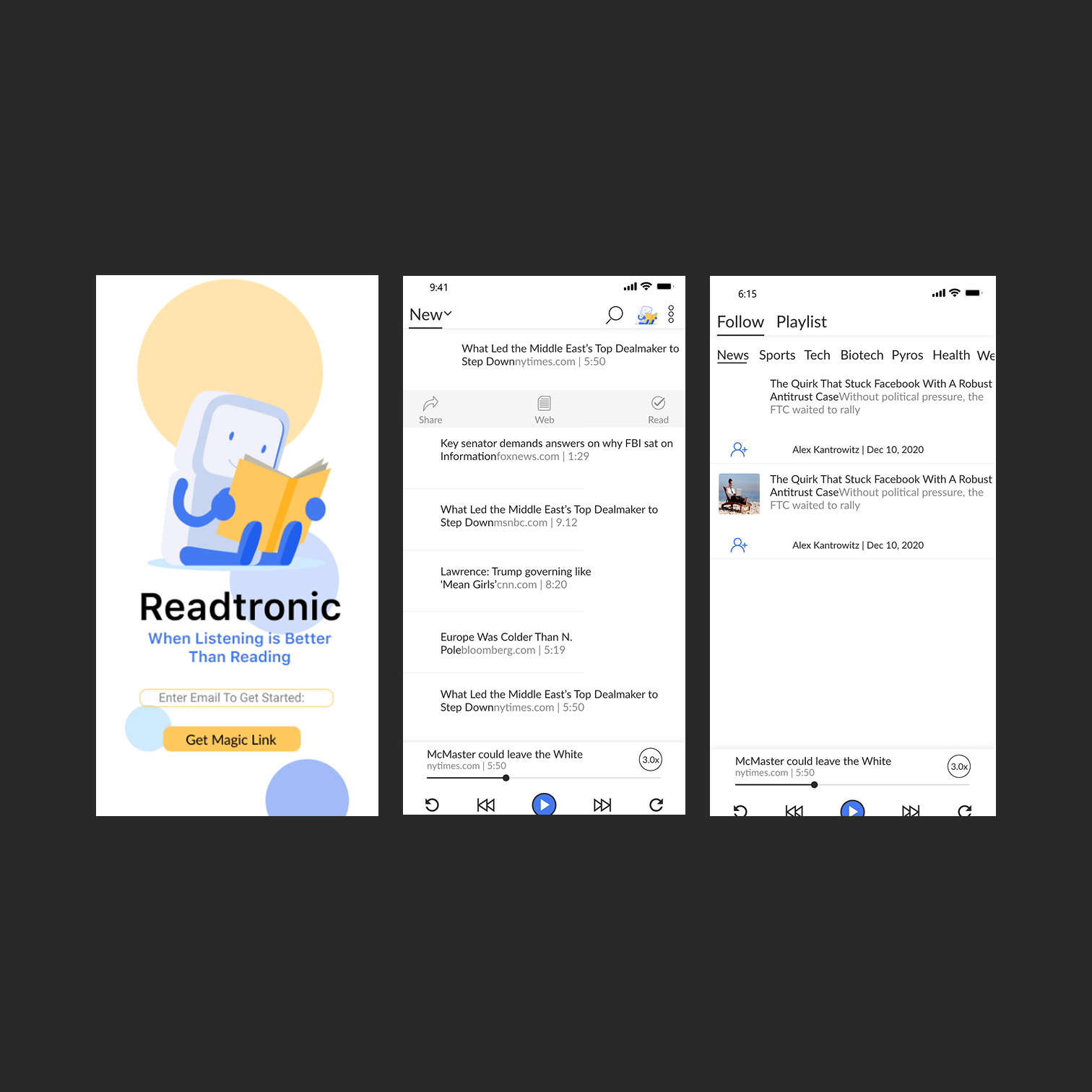
In high-fidelity testing, the discover page labeling still caused some friction.
Testers wanted to browse by topic rather than curated labels like "trending."
They also asked for article recommendations based on what they were already listening to; a signal that the personalization layer needed to go deeper than surface-level groupings.
By the final round of usability testing, testers were completing tasks faster and with less confusion.
The feedback was consistent: the interface felt cleaner, more intuitive, and easier to navigate. Compared to baseline testing;
where one user couldn't even finish a task; the improvement was measurable.
Prioritizing user feedback at each stage of the design process made the difference.
Please Scroll